

Conservation makes me creatively competitive.
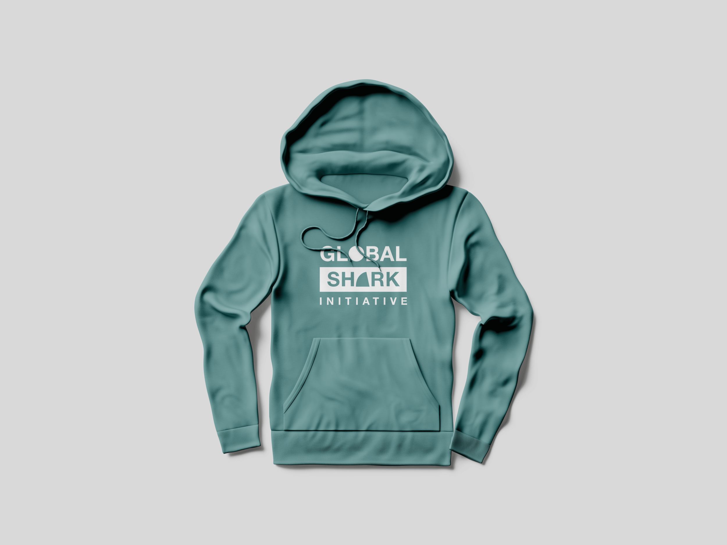
Global Shark Initiative, a newly formed organisation put the call out for designers to volunteer their time and skill to help create an identity that they could then use to promote shark conservation.
I don’t usually enter design competitions as I’m not into the flashy side of it all. Yet, I entered.
I wanted to create an identity that was strongly symbolic of planet ocean and sharks without the need for images or additional bylines. It was important that it could easily be used across print and digital media. I intentionally used an easily read typeface. It seemed Helvetica Neue was a good match as it used so heavily across warning and informative signage, I knew it would stand out.
The vote for the winner was put to the public to decide, I was named as a finalist. I didn’t win and I wasn’t overly bothered. I enjoyed the challenge and an effort to do some social good.
It definitely helped that I have been obsessed with these animals since I was a child. If you do happen to engage me in a conversation about sharks and rays you’ll be lucky to get away.


Sharks are the new whales.
Despite what you may have seen when you watched Jaws as a youngster, sharks have little interest in humans. We’re just not blubbery or salty enough for them.
Sharks have an electro-sensory system all around their head and snout, these tiny receptors pick up tiny electric fields.
A shark will investigate in a series of events after sensing something in the water emitting an electrical charge towards them. They will approach and ‘bump’, if a shark is interested it will then take a bite.
This is why you see sharks mouthing boat motors and sadly on rare occasions, people swimming at dawn or dusk (when sharks are most active). Tragically most people will pass away due to blood loss from these investigative bites.
Once sharks were a species that were prized and taken in sustainable volumes by small ocean faring communities to feed many generations. However, they are now targeted by large corporations solely for their fins.
Sharks face the every day threat of overfishing causing some species to be struggling on the brink of extinction.
With our oceans being degraded, it’s more important now than ever to protect and educate around the importance of sharks to our oceans.
#sharkconservation
Photo by Jakob Owens on Unsplash