

A business established during lockdown, a glow up was on the cards for 2021.
Client: Little Spoon Sourdough Crumpets. Project: Rebrand, packaging labels, cards, stamps.
Little Spoon originated during lockdown, like many other small businesses in 2020. The business needed a ‘look’ so it was quickly created using online design tools. Little Spoon was trading in no time with a boho style logo to represent their services.
Fast forward to 2021, the sourdough crumpet company had grown, selling at markets and online.
With the growth in the business, my client required professional labels to move into selling throughout retail stores in Wellington. A few courageous conversations later and we started working collectively on a refresh of the Little Spoon brand. Clare the crumpetier and I spent time workshopping through inspirational designs and sat side by side working on the new look.
Staying true to their origin story, Little Spoon now has a retail-ready look that still retains it’s humble yet professional artisan beginnings.


Packaging.
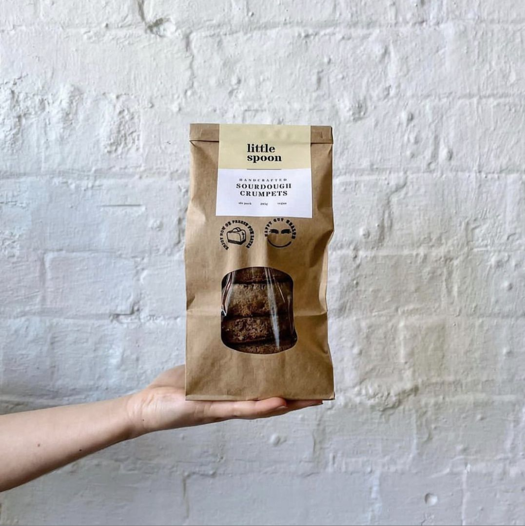
When you’ve got a great product, you need to level-up your packaging to get you seen on the shelf in a highly competitive market. I designed some new labels for Little Spoon, that needed to include a fair amount of information for consumer use. They are intentionally designed to fold over the top of the paper bag to ensure integrity to the sourdough crumpets prior to distribution. The front of the label clearly displays the product name and the rear contains all the required nutritional data and other miscellaneous information.
To complete the handmade, artisan style I also worked on some high quality stamps to be used across retail and market take away packaging.
Photos: Little Spoon Sourdough Crumpets


